Webflow Analyze: Visual Analytics at Your Fingertips in Webflow
Web design isn’t just about making a site look good – it’s also about how the site performs. You might have a gorgeous Webflow site, but do you know which sections captivate your visitors and which ones they ignore? Traditionally, answering those questions meant juggling third-party analytics tools, adding tracking codes, and interpreting abstract charts. It could be a headache, especially if you’re not an analytics expert.
Enter Webflow Analyze, Webflow’s native visual analytics add-on that puts actionable data right where you build your site. In this post, we’ll explore what Webflow Analyze is, how its scrollmaps and clickmaps help you understand user behavior at a glance, and why this tool is a game-changer for Webflow users of all levels – from beginners to agencies. If you’ve ever wished for an easier way to see what’s working on your website (and what’s not), read on!
What is Webflow Analyze?
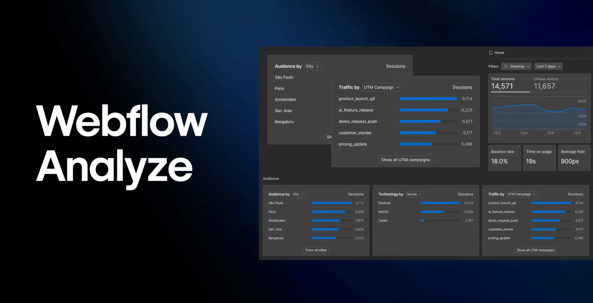
Webflow Analyze is a new integrated analytics tool built directly into the Webflow platform. Think of it as Webflow’s answer to understanding your site’s visitor behavior without needing to bolt on Google Analytics or other external services. It provides a unified dashboard of key metrics and visual insights right inside Webflow.
With Webflow Analyze, designers, marketers, and content creators can quickly get answers to questions like:
- How many people are visiting my site and which pages are they viewing?
- Where are visitors clicking on each page?
- How far are they scrolling down the page?
The beauty of Analyze is its simplicity and seamless integration. Setting it up is a breeze – it’s essentially a one-click activation on any Webflow Site plan (Basic, CMS, Business, or Enterprise). There’s no need to wrangle with code snippets or configure external dashboards. Once enabled, Webflow starts automatically tracking events and traffic on your site. All your data stays within the Webflow ecosystem, too, which means fewer privacy concerns and no dealing with third-party cookies or scripts.
Key features at a glance: Webflow Analyze tracks essential website metrics out-of-the-box, including page views, sessions, bounce rate, form submissions, and more, displayed in a clean, easy-to-navigate interface. This covers the basics that most site owners care about, without overwhelming you with the complexity that tools like Google Analytics can sometimes bring. It’s designed for quick, digestible insights that anyone on your team can understand – even if you’re not an “analytics person.”
One important thing to note is that Webflow Analyze is a paid add-on to your site plan. It’s not included for free in the standard Webflow plans (since it’s quite a powerful addition). Pricing is tiered based on your traffic – for example, starting at around $29/month for up to 10,000 monthly sessions, with higher tiers for sites that get more visitors. The add-on can be enabled per project, so you can choose which of your sites need that in-depth insight. While it’s an extra investment, many users find the convenience and time saved well worth it. After all, having immediate clarity on how your design is performing can pay dividends in better conversions and user experience.
Visual Analytics on the Canvas: Clickmaps & Scrollmaps
The standout capability of Webflow Analyze – and the feature that has Webflow users buzzing – is its visual analytics overlays. Specifically, Webflow Analyze introduced clickmaps (in June 2025) and scrollmaps (in July 2025) that display user engagement data directly on your site’s canvas. This is a game-changer in turning abstract numbers into intuitive visuals.
Clickmaps: See What Your Visitors Click
Clickmaps are essentially heatmaps of where users click on your webpage. When you enable Analyze Mode and view a page’s clickmap, you’ll see a visual overlay highlighting the parts of the page that received the most clicks. The more an area is clicked, the more “heated” (brightly colored) it appears on the overlay. This instantly shows you which buttons, links, images, or other elements are attracting attention – and which are being ignored.
Why is this valuable? Imagine you have a call-to-action button at the bottom of your homepage. You think it’s obvious, but the clickmap might reveal that hardly anyone is clicking it – maybe because it’s too far down or not eye-catching enough. Or perhaps you find people are clicking on an element that isn’t even a link (for example, a headline or image that they expect to be interactive). Insights like these are pure gold for a designer. With a clickmap, you don’t have to guess where visitors are trying to interact; you can literally see it. This helps you make informed design tweaks: move a button to a more visible spot, make a popular image into a link, or simplify your navigation if an unwanted element is drawing clicks away from where you want them.
The best part is that clickmaps in Webflow Analyze require no extra setup – no embedding external heatmap scripts or waiting days for data. If your site has Analyze enabled, you just go into Analyze Mode in the Webflow Designer, and toggle to view the clickmap for the page. Instantly, you get an overlay of click activity on top of your live design. It’s as if you had an x-ray of your users’ collective mouse clicks, directly on the canvas you’re working on. This tight integration means you can identify an issue (say, a rarely-clicked signup button) and switch right back to Design Mode to improve it, without missing a beat. The feedback loop between seeing the data and acting on it is incredibly short and sweet.
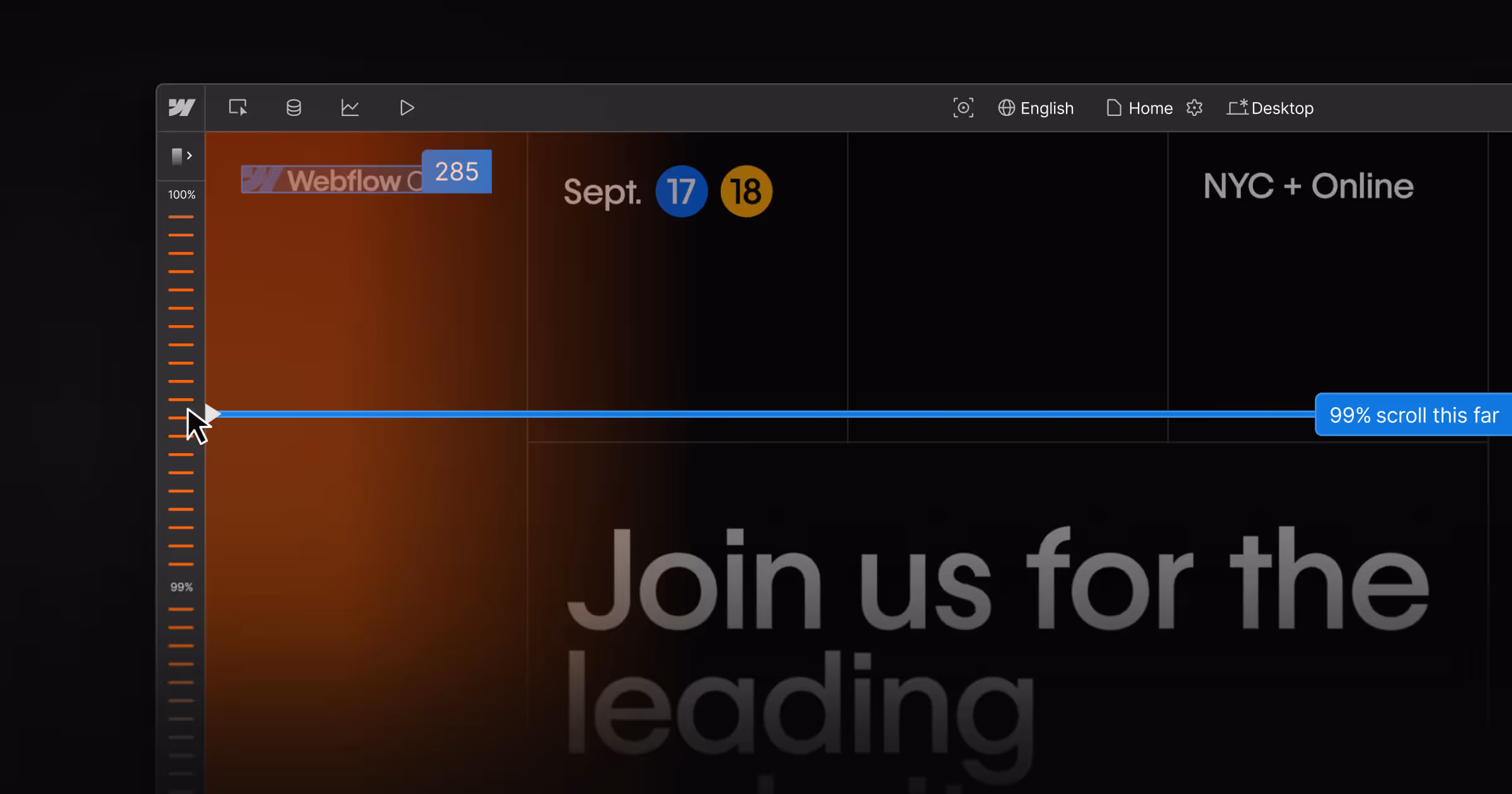
Scrollmaps: Understand How Far Down Visitors Scroll
Where clickmaps show you where users click, scrollmaps show you how far your users scroll down each page. It’s like a “depth map” for engagement. When you open a scrollmap in Analyze Mode, your page gets overlaid with a gradient from top to bottom. The top of the page (which everyone sees when they land on it) will typically be “hot” (warm colors), and as you move downward, the colors cool off as fewer and fewer visitors reach those sections.
Scrollmaps in Webflow Analyze provide a few specific insights:
- Average page fold – This indicates the point on the page where most users initially land (essentially the viewport cutoff for the average visitor). It’s a marker showing what percentage of visitors see what lies “above the fold.” Content below that line might be missed by a majority of users unless they scroll.
- Visual gradient overlay – A color-coded overlay that instantly tells you which parts of the page are seen by almost everyone (red/orange zones) versus sections that only a minority see (blue/cool zones). This gradient view gives a quick sense of where attention drops off.
- Scroll ruler – A ruler running alongside the page that shows the percentage of visitors who reached each horizontal level of the page. For example, you might see markers like “75% of visitors reached here, 50% reached here, 25% reached here” as you go down. This quantifies the drop-off points.
- Dynamic scroll line – A super handy tool: you can press the Shift key (in Analyze Mode) and hover over any point on your page to see exactly what percentage of visitors scrolled to that point. It’s like a laser pointer for exact stats. Wondering how many people saw that pricing table midway down? Shift-hover on it and it might say “40% of visitors reached this section.”
So, what can you do with this info? A lot! If you discover that, say, 90% of visitors never scroll past a certain section, and that section happens to be a giant block of text or an image carousel, it might indicate that content isn’t engaging or that it’s too far down. Perhaps your page is too long, or the most important info needs to be higher up. On the flip side, if an important call-to-action or testimonial is sitting in a “cold” zone (meaning very few people scroll that far), you likely want to move that content higher or break it into multiple pages. Scrollmaps essentially alert you to content that’s getting buried too low on the page.
One especially useful insight from scrollmaps is identifying the “average fold.” If you know where most users’ screens cut off the initial view, you can ensure your most compelling content – like a headline, key image, or sign-up form – sits above or around that line. For instance, if the average fold on your blog page is 600px down, and your subscription sign-up box is at 800px, a significant chunk of visitors might never even know it exists. With scrollmap data, you can adjust your layout to tease that subscription box higher, or introduce an earlier call-to-action.
Just like with clickmaps, Webflow’s scrollmaps are built-in and immediate. The data overlays on your actual page design. You don’t have to interpret an external chart or graph; you’re looking at the page itself with an added layer of insight. It feels very intuitive – almost like having special goggles that reveal user behavior on top of your design.
Data-Backed Decisions Without the Hassle
Both clickmaps and scrollmaps exemplify what makes Webflow Analyze special: they bridge the gap between design and data. These features turn analytics from a dry, separate task (“let me log into this other tool and see a bunch of numbers”) into a natural part of the design workflow (“let me see how this page is doing and tweak it right here”).
For Webflow users, especially those who aren’t analytics pros, this lowers the barrier to using data effectively. You don’t need to wade through spreadsheets or complex dashboards. You just flip a switch to Analyze Mode, and insightful visuals are right there. It encourages a habit of continuous improvement – you can quickly check, “Are people interacting with my new feature section?” If the clickmap shows a big blue spot (no clicks) on that shiny new button you added, you’ve got instant feedback to try something different.
Why Webflow Analyze Is a Game-Changer for All Webflow Users
Webflow Analyze isn’t just another fancy feature – it fundamentally changes how different users approach website optimization in Webflow. Here’s how it benefits various members of the Webflow community:
For solo builders and beginners: If you’re relatively new to Webflow or building your first site, analytics can be intimidating. Many beginners either skip analytics entirely (flying blind) or they add Google Analytics but rarely check it because it’s complex. With Webflow Analyze, there’s no steep learning curve. You get straightforward metrics and visualizations that tell you, in plain terms, what’s happening on your site. This helps you learn and improve your site with confidence. For example, if you launch your site and see a high bounce rate on your homepage, you’ll know to investigate why visitors aren’t sticking around. If your contact page’s scrollmap shows nobody reaches the bottom (where your contact form is), you’ll realize you should move that form higher. In short, Webflow Analyze acts like a friendly mentor, guiding you toward best practices by showing real user behavior. Plus, one-click setup means even non-technical folks can get insights without breaking a sweat.
For experienced designers and Webflow power users: If you’re a Webflow whiz cranking out sites regularly, Analyze becomes your secret weapon for fine-tuning and validating your design decisions. Instead of making educated guesses about design changes, you can A/B test in a more manual but effective way: tweak a page, watch how user behavior changes via the clickmap or scrollmap, and iterate again. Because the analytics are integrated, you can do this rapidly. It’s almost like having a built-in user testing lab. Let’s say you’re unsure whether a sticky navbar or a top banner is more effective for engagement – you could try one approach for a week, then the other, and let the Analyze data inform the winner. Advanced users will also appreciate the privacy aspect: client data stays inside Webflow, which can simplify compliance with GDPR and other privacy laws (no need to funnel data to external analytics services if you don’t want to).
For agencies and freelancers working with clients: Webflow Analyze can elevate your service offering. Imagine being able to tell your client, “Not only will I build you a beautiful website, I’ll also help you continuously improve it with real user data – using Webflow’s built-in tools.” Many clients love to see numbers and evidence. With Analyze, you can periodically generate insights for them: show heatmaps of where their customers click, demonstrate that a recent redesign improved scroll depth on key pages, or identify pages that need content adjustments due to high drop-off. It’s an upsell opportunity as well – since Analyze is an add-on, you might build it into your proposal as part of an ongoing optimization package. The visual nature of clickmaps and scrollmaps makes it easy to communicate to clients. There’s no mystique: a client can literally see “Oh, wow, hardly anyone clicks on that product over there” or “Look, everyone stops scrolling right before the pricing section – maybe we should simplify it.” This fosters collaborative decision-making and positions you as a data-driven expert. Plus, enabling Analyze is much simpler than configuring a third-party analytics solution for each client, saving you time.
For marketers and content strategists: Webflow Analyze isn’t just for design tweaks – it’s also valuable for marketing folks who care about conversion rates and content performance. If you’re using Webflow’s CMS for content marketing, the analytics can guide your strategy. For instance, check the page views and engagement on your blog posts: which topics keep people scrolling to the end? Which posts have a high bounce rate (indicating maybe the content didn’t match expectations or wasn’t engaging)? If you run landing pages or campaign pages in Webflow, Analyze helps you monitor those campaigns in real time. You can see if people are clicking the signup link or if they’re dropping off too soon – allowing you to adjust your content or layout quickly to improve results. Marketers who are used to traditional analytics will still appreciate how quickly they can access the data without jumping between tools. It brings the whole team (designers, marketers, writers) onto the same page, literally looking at the same on-canvas data when discussing improvements.
In summary, Webflow Analyze democratizes analytics. It’s not just the domain of data analysts or marketing departments – it’s now part of the Webflow designer’s toolkit. By making analytics visual and accessible, Webflow is encouraging a culture where every Webflow user can be data-informed. No more flying blind or relying solely on gut feeling; you have evidence at your fingertips to support your design and content choices.
Getting Started with Webflow Analyze
Ready to give Webflow Analyze a spin? Here’s how to get up and running and what to expect:
1. Enable the Analyze Add-on: In your Webflow project settings (for a site you want to track), you’ll find an option to add Webflow Analyze. Since it’s a paid add-on, you’ll go through a checkout to select the plan tier that fits your traffic. (If you’re unsure how much traffic you get, err on the lower side – you can always upgrade the tier if needed.) Once purchased, the Analyze features become active for that site. Remember, Analyze is enabled per site project, so you have control over which sites use it.
2. Access Analyze Mode in the Designer: Webflow’s interface will reveal a new mode (in the top bar of the Designer, next to where you toggle between Design, Preview, etc.). This is the Analyze Mode. Click that, and your canvas will switch into an analytics view. You might see an overview of site metrics and can navigate to specific pages to see their data overlays.
3. View Site-wide and Page-specific Insights: In Analyze Mode, you’ll typically get two levels of info – high-level site stats (total traffic, top pages, etc.) and the ability to drill down into each page for clickmaps and scrollmaps. It’s very intuitive. For example, you might select your homepage and toggle on the clickmap view. Instantly, you’ll see those nice heat overlays on your homepage design showing click density. Switch to scrollmap view, and you’ll see how far people scroll on average. It’s fun to explore each key page of your site this way.
4. Interpret and Iterate: Once you have the data, use it! Maybe you learn that your about page is surprisingly popular but has a high bounce rate. That’s a prompt to spice up the content or add a clearer call-to-action there. Or you might find that mobile visitors never tap a certain button that desktop users do – perhaps the button is too low on mobile or not visible enough. Because Analyze Mode is right there in your Designer, you can seamlessly hop back to design view, make an adjustment, and then keep an eye on how the metrics respond over time. Webflow Analyze updates continuously, so you can check back after a few days or weeks to see trends.
5. Share Results (Optional): If you want to share these insights with teammates or clients, Webflow might not (currently) have an export heatmap feature, but you can always screenshot the Analyze overlays or manually report the findings. This can spark great discussions on how to improve the site further. Since Webflow Analyze is an evolving tool, keep an eye out – Webflow’s team is actively adding features (scrollmaps and clickmaps were early additions, and who knows, more useful analytics features could be on the horizon). It shows Webflow’s commitment to not just let you build websites, but also continually refine them.
One more thing: if your site is brand new or doesn’t have much traffic yet, give it some time after enabling Analyze to accumulate data. You’ll need visitors to generate those pretty heatmaps! It might take a few days or weeks to gather meaningful patterns, depending on your traffic volume. Don’t be discouraged by sparse data at first – as your audience grows, the insights will become clearer.
Conclusion: Design, Analyze, Improve – All in One Place
Webflow Analyze brings website analytics and design together under one roof, empowering you to make informed improvements without leaving your Webflow workspace. It’s all about working smarter, not harder. Instead of pouring over external analytics dashboards or making wild guesses about your site’s performance, you can now see exactly what your visitors are doing and adapt on the fly.
For Webflow users, this feels like a natural extension of the no-code philosophy – just as Webflow made building websites visual and code-free, now it’s making understanding user behavior intuitive and code-free. Whether you’re a solo creator curious about how people engage with your portfolio, an agency optimizing client sites for better ROI, or a marketer fine-tuning landing pages, Webflow Analyze provides the clarity you need to take your websites to the next level.
In the fast-paced world of web design, having data-driven insights at your disposal can be the difference between a good site and a great site. Webflow Analyze gives you those insights in a friendly, visual way. I’ve been impressed with how it has helped me catch things I would’ve otherwise missed – and saved me from spending time on changes that wouldn’t have mattered to users. It reinforces the idea that design is never “done”; you can continuously iterate and improve, now with evidence guiding your decisions.
Ready to turn on the lights and see how your Webflow site is really doing? Try it now and explore Webflow Analyze for yourself. Play around with the clickmaps and scrollmaps on your own project – I suspect you’ll have a few “aha!” moments about your site’s user experience. And as you harness those insights to refine your site, you’ll be delivering a better experience for your visitors and better results for yourself or your clients. Happy analyzing, and happy designing!
Start Your Webflow Journey
Discover the power of Webflow and begin creating beautiful, responsive websites today. Click below to get started directly on Webflow’s platform.
You Might Also Like
Explore our recommended articles for more Webflow tips, tricks, and inspiration to enhance your design workflow.