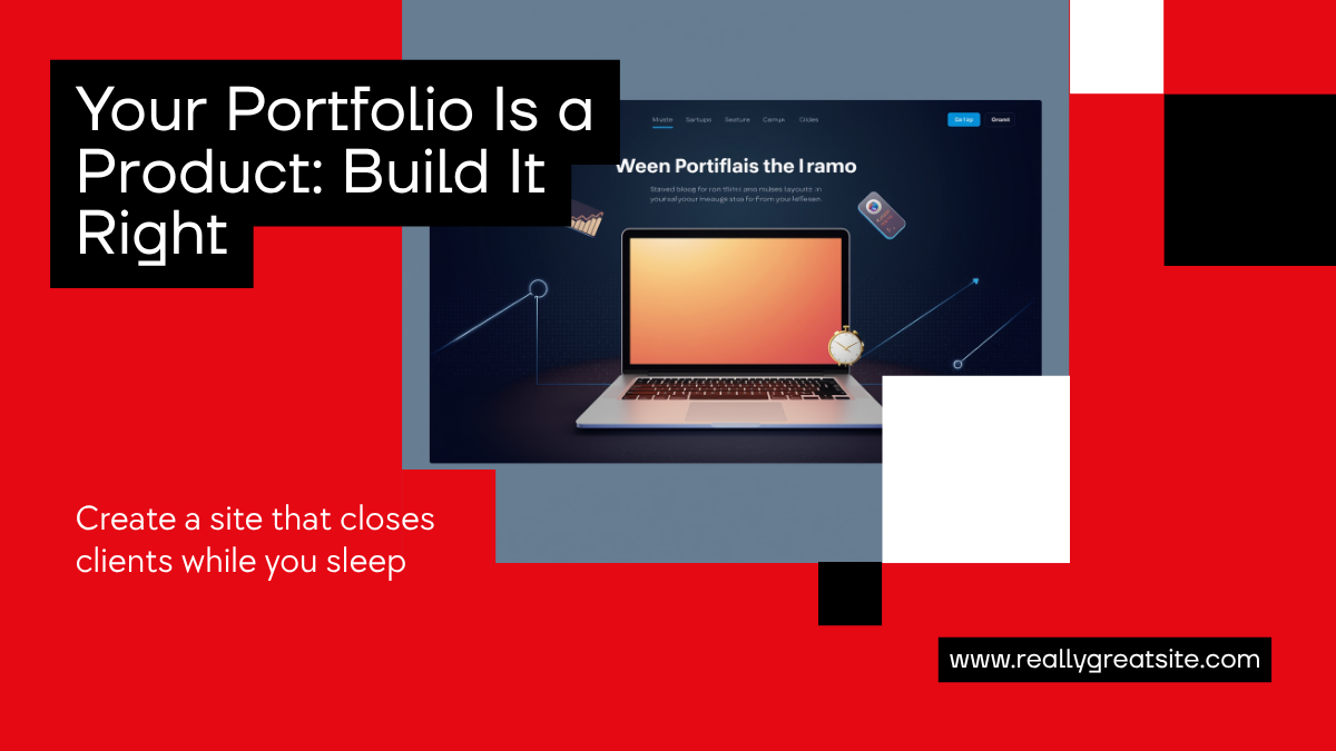
Your Portfolio Is a Product: How to Build a Site That Closes Clients While You Sleep
Most freelancers and independent designers build their portfolio like an art gallery: beautiful, curated, and completely passive. They expect visitors to browse, admire, and somehow reach out. But when attention spans are shorter and clients have more options than ever, a passive portfolio is a missed opportunity.
The most effective portfolios today are not galleries. They are products.
This shift changes everything about how you design, write, and optimize your site.
The Gallery vs. Product Mindset
A gallery says: Look at my work.
A product says: Here is what I can do for you.
The difference is not just semantic. It shows up in every design decision, every piece of copy, and every conversion element on your site.
When you think of your portfolio as a product, you start asking different questions:
- Who is my ideal visitor?
- What action do I want them to take?
- Where are they dropping off?
- What objection am I not addressing?
These are product questions. And they are exactly the right questions to ask about your freelance site.
What a High-Converting Portfolio Actually Does
A portfolio that closes clients does not just show work. It does several things simultaneously.
It qualifies visitors. The best freelance sites self-select their audience. The copy, the case studies, the pricing signals, the overall tone all work together to filter for the right kind of client. This saves you from wasting time on poor-fit prospects.
It builds trust before the first conversation. Case studies that explain the problem, the process, and the measurable outcome build more trust than a beautiful screenshot ever could. Clients do not hire talent. They hire someone who understands their problem.
It makes the next step frictionless. How many clicks does it take to contact you? If it is more than one, you are losing clients. Product thinking means removing every unnecessary step between interested and in conversation.
The Three Sections That Actually Matter
Forget the traditional About, Work, Contact structure. Here is the layout that converts.
1. The Promise (Above the Fold)
Your hero section is not the place for your name and job title. It is the place for your value proposition. What specific outcome do you help clients achieve? Lead with that.
Weak: Designer and Developer based in Berlin
Strong: I help SaaS founders go from wireframe to live Webflow site in under 3 weeks.
2. The Proof (Case Studies, Not a Portfolio Grid)
Instead of a thumbnail grid, feature two or three case studies that tell a story. Each one should cover:
- The client's situation before you
- The challenge they faced
- Your specific approach
- The measurable result
A client reading this should think: This person gets it.
3. The Path (Clear Next Step)
End every page with a clear, low-friction call to action. Not just Contact me. Make it specific: Book a 20-minute call, or Send me your brief. Tell them exactly what happens next.
What Webflow Changes About This
Building this kind of portfolio used to require a developer. Today, Webflow makes it possible to build, test, and iterate on a high-converting freelance site without writing a single line of code.
More importantly, Webflow lets you actually think like a product person about your site:
- Run A/B tests on headlines
- Swap out hero copy based on traffic source
- Add CMS-powered case studies that are easy to update
- Use interactions to make the experience feel premium without bloating the budget
The gap between I have an idea and it is live is now measured in hours, not weeks. That is a competitive advantage if you use it intentionally.
Metrics That Tell You If It Is Working
If you treat your portfolio like a product, measure it like one:
- Time on site: Are visitors actually reading, or bouncing immediately?
- Scroll depth: Are they reaching your case studies and CTA?
- Contact form conversion rate: Of people who visit, how many reach out?
- Traffic source: Where are your best clients coming from?
You do not need a complex analytics stack. Plausible or a simple Google Analytics setup is enough to start making data-informed decisions.
The Continuous Improvement Loop
A product is never finished. Neither is a good freelance site.
Every client conversation gives you data. When someone asks the same question twice, it means your site is not answering it. When a client says I found you because of your case study on X, double down on that.
Treat your portfolio like a startup treats its product: ship, measure, improve, repeat.
Final Takeaway
The freelancers who win are not the most talented ones. They are the ones who treat their presence on the internet like a serious business asset.
Your portfolio is the only salesperson that works 24/7, never takes a day off, and does not require a commission. Build it like a product, not a gallery, and it will close clients while you sleep.
Start Your Webflow Journey
Discover the power of Webflow and begin creating beautiful, responsive websites today. Click below to get started directly on Webflow’s platform.
You Might Also Like
Explore our recommended articles for more Webflow tips, tricks, and inspiration to enhance your design workflow.

.avif)